What is browser testing and why does it take so long?
Your design is built, content loaded, media is in and your site looks great on your computer -you’re ready to launch so why the sudden hold up with browser testing and why is it going to take so long?
Take this issue I ran into earlier this week. Can you spot the difference?
 |
 |
The headings are displaying differently that’s right! The site uses a specific font for headings which looked great on desktop and Android phones but when I checked the website on my iPhone, things didn’t look so pretty.
There were no errors being thrown to indicate that there was an issue. Emulating various mobile devices with my browser hadn’t revealed the problem - it all looked great. It was only when I deployed my local website to a server and picked up my phone to take a look that I was aware of an issue. This is one of those cases that you really only discover by manually checking a website on an actual device.
In this scenario the issue is cosmetic, but in some cases, it might be critical - a page can look right visually, but if a button can’t be clicked then it’s game over as far as your visitor is concerned especially if you’re building e-commerce sites like this one.
It’s crucial to test your website in as many different devices, browsers and operating systems as is practical to give your visitors the best possible experience. The process of doing this is called front-end testing (in web-speak, ‘front-end’ generally refers to the parts of your website that you can see and interact with - text, links, buttons, images, forms etc. ‘Back-end`’ is about serving up the data that drives your site).
What do we check?
There are a number of things to consider when testing a web page:
- Visuals - does it match the design as closely as possible?
- Functionality - does everything work as expected? Is the content readable? Can buttons be clicked? Are there javascript errors that would prevent users logging in or adding an item to a cart?
- Accessibility - could the page be used by someone with impaired vision, or someone unable to use a mouse or a keyboard?
- Performance - does the page load and respond quickly?
- Knock-on effects - could there be any unexpected consequences from this work on other pages of the site? Styles and scripts are usually available across multiple sections of your site, and changes can bleed through in ways that aren’t immediately obvious.
Responsive testing
When we talk about responsive testing, we’re talking about all the checks listed above being performed on a variety of devices, screen sizes and operating systems. We generally build our sites to support four main sizes, all of which need to be tested on each supported browser/device!
Let’s take a look at the top web browsers in 2020:
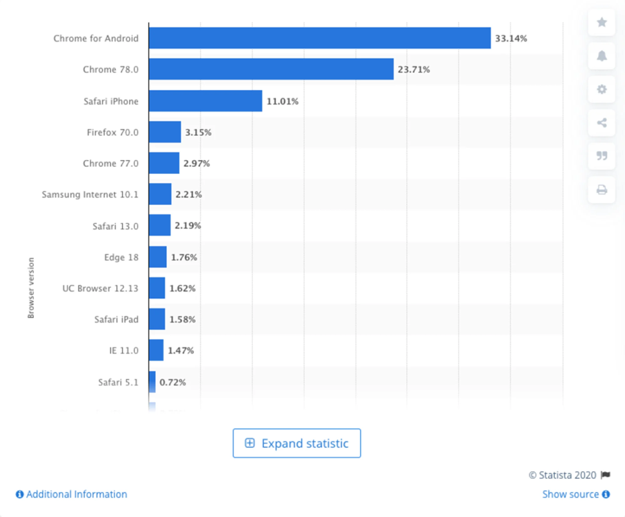

https://www.smashingmagazine.com/2020/02/cross-browser-testing-efficient-lambdatest/
My default development setup when I’m working is the latest version of Chrome on a desktop PC -which covers only 23.71% of browsers in the chart above. Mobile browsers are incredibly important, with Chrome for Android being the most popular and Safari on iOS coming in at number 3. Not to mention most websites are now well over 70% mobile traffic.
So, let’s just take those top 3 browsers and go test our website. We use a tool calledBrowserstack for this because it provides actual devices for testing, not just emulators or simulators which often don’t tell the whole story (as we saw in my screenshots above).
Starting with Chrome for Android (our #1 browser above), browserstack has 63 devices from 6 different manufacturers and a number of operating system versions: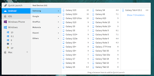
Looking at Chrome on a PC, we’ve got 48 versions of Chrome and 5 different Windows operating system versions to choose from: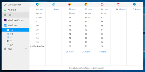
Not to mention 46 versions of Chrome and 10 different MacOS versions: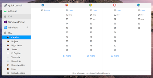
Our third browser, Safari on iPhone, can be tested on 25 different devices: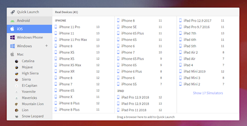
All this, and we haven’t even started looking at other browsers (Firefox, Edge, Internet Explorer 11…).
Unless your project has an unlimited budget, testing every possible setup after every change just isn’t practical. To keep things moving in a reasonable timeframe, we may limit our testing to just the most up-to-date browsers on a few recent devices. We also focus on the areas of the site which may have been impacted -and have a quick check over the others just to make sure.
Data from Google Analytics or similar can help us choose the most important targets for your website which helps streamline the process but even so, thorough testing takes time.
Generally we test each page/journey in 38 different device/browser combinations (unless requested otherwise):
- PC
- Chrome (latest): 1024x768 / 1280x1024 / 1920x1280
- Edge (latest): 1024x768 / 1280x1024 / 1920x1280
- Firefox (latest): 1024x768 / 1280x1024 / 1920x1280
- IE11: 1024x768 / 1280x1024 / 1920x1280
- IE10: 1024x768 / 1280x1024 / 1920x1280
- Mac
- Safari (latest): 1024x768 / 1280x1024 / 1920x1280
- Chrome (latest): 1024x768 / 1280x1024 / 1920x1280
- Firefox (latest): 1024x768 / 1280x1024 / 1920x1280
- iPhone 6
- Safari (latest): Portrait / Landscape
- Chrome (latest): Portrait / Landscape
- iPhone 11
- Safari (latest): Portrait / Landscape
- Chrome (latest): Portrait / Landscape
- iPad Pro
- Safari (latest): Portrait / Landscape
- Chrome (latest): Portrait / Landscape
- Android
- Chrome (latest): Portrait / Landscape
That means even the most basic test which takes 5 minutes, will result in over 3 hours of testing per page! The best of it is we may find a bug on the last test which means we need to run through the entire test plan from the start!
Once the initial version of the page has been created and tested, we can automate the process for future runs using tools like Selenium. However, only helps speed up testing later down the line.
So there you have it. Front end testing is almost invisible when done well, and it takes time, but it’s essential for keeping your website functioning as beautifully, quickly and error-free as possible. It’s well worth investing the time so that your visitors have the best possible experience regardless of the device or browser they’re using.
So in conclusion, there are some quick wins when testing but full end-to-end browser and device testing takes time but it's time very well spent!
Liked this post? Got a suggestion? Leave a comment